
Throughout this demonstration I will be using "Sealife" (c)FabaScrapDesigns and "Fishy Fishy" (c)Connie Prince. I really like the elements and alpha in Sealife and see that I am not going to have to alter much, if anything, in the kit. The papers leave something to be desired for the layout I plan on doing. While Connie's papers in Fishy Fishy are what I was looking for in terms of texture and pattern.
Using the color picker and my photo (enlarged so that I can see individual pixels) I will be picking a color from it. On the palette toolbar to select the sample size. Choosing 1x1 will pick up the color of the pixel you have chosen.
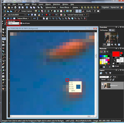
By choosing one of the other selections; i.e. 3x3, 6x6, 9x9 or 11x11, the picker will average the colors of the surrounding pixels for the color.

1. Click on the color in the material palette to bring up the
2. Materials Property box.
3. Click on add to swatch and
4. Name it. Since I will be deleting the swatch after using I just give it a name of 0000 so that it is the first swatch on the swatches palette.

With the materials property box still open write down the H and S numbers (Hue and Saturation).

After chosing the paper (element), go to Adjust>Hue and Saturation>Colorize (shift+l). Put in the numbers of the Hue and Saturation that you wrote down in the corresponding boxes. (I just colored one-half for demonstration purposes only).

If you want to lighten or darken the color go to Adjust>Hue and Saturation>Hue/Saturation/Lightness (shift+h). Make sure the hue and saturation are set to zero (0) then move the Lightness slider up to make the color lighter or down to make it darker.

Do the same for any other papers or elements you want to alter. To change just a specific area or color on the paper or element, use the magic wand with the tolerance set to about 30 (depending on the contrast of the edges. Not much, lower the number, if a lot you can probably set it higher) and make sure contiguous is unchecked. Then follow colorize and lightness directions above.

I have recolored the blue background paper, blue circle (readjusting the lightness), dots on polka dot circle, bubbles and the alpha.

Sealife (c)FabaScrapDesigns; Fishy Fishy (c)Connie Prince
Template by Jen Yurko
Template by Jen Yurko
No comments:
Post a Comment
Note: Only a member of this blog may post a comment.