And I don't mean Centauri, but those cute pre-made alphabets that come with some kits or can be downloaded by themselves. They are fondly referred to as alphas and they are not fonts.
They can come as fulls sheets (as shown), individual alphas or both.

To use a full sheet, marquee around the tallest character you will be using. Edit>copy; then Edit>paste as a new image. (You will be repeating this for each character you will need. *See note at end if you have duplicate characters)

The next shows the one I copied from a full sheet next to an individual alpha (this alpha set came with both)

At 100% they actually are the same size. The difference being all the space around the copied image. If you are using a copy from a full sheet, you will need to: control & a (select all); control & f (float); control & shift & f (defloat). The go to Images>crop to selection.

Now you are going to want to size it. Looking at my layout, I know that I want the tallest character to be 1/2 inch tall.

Going back to the alpha: Image>resize (shift & s). AFTERTHOUGHT NOTE: Even though the panels show capital letters for keyboard shortcuts, use the lowercase letters.
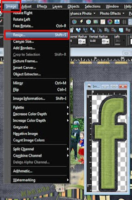
In your resize dialogue box make sure the resolution is set to the measurement you use (inches or centimeters). Mine, for some reason always defaults to centimeters. In the Print size area fill in the height box. I set mine to .5; next and very important, in the pixel dimension area set it to percent. Write down the percentage number (46% on mine). This is the box and the number you will use to resize the rest of your alphas.

Copy/paste or drop/drag to your layout, then get the next alpha. Instead of putting the height in the print size area, you will put your percentage number in the pixel dimension area. Although they won't be the same size height wise they will be in proportion. Continue with remaining alphas, putting them on the layout as you finish with them. NOTE: Make sure that if you are working with individual alphas that you close them WITHOUT saving.

As you copy/paste or drag/drop the alphas will be centered on the layout. Not to fret they are on separate layers and easily moved. That is where we are headed now.

The easiest way to place the alphas is in a straight line using a guide line. Under view, make sure that rulers, guides and snap to guides is checked. Then click on the change grid, guide & snap properties.

In the properties dialogue box click on the guide tab. If the snap influence isn't already set to 15 change it to that in both boxes, change the guide colors if the color (click on the bottom color box) will be hard to see on your layout and okay.

Back on the layout, place the cursor on the ruler bar. Left click, hold and drag down a little way and release. This is just a temporary placement as PSP has a tendency to freeze if you try and place it precisely while holding it. Besides there is an easier and more accurate way.

Next you have to decide where you want your alphas to be placed. I'm working on a 12x12 layout and wanted my down at 9 3/4". What you will do next is place your cursor on the ruler bar next to the guide line.

Right click to bring up the guide properties box. In the guide position box put where you want the guide line to be place (9.75" for me) and click okay.

My guide line has now moved down 9 3/4". As you place the alphas near the guide you will feel (for the lack of a better word) a tug like placing to weak magnets near one another, snapping the alpha to the line (it will also snap to the center of the image if you get it close enough to the center). After you have finished placing all the alphas bring the guide properties box back up and click on delete.

But if you want your alphas to follow a contour, you can do that by using the pick tool (k on the keyboard) and rotating them into place.

Hope this gives you some ideas on how to use alphas and your guide lines.
NOTE: If you have duplicate characters; you don't have to keep getting it from the folder or the full sheet. Once you have it on the layout just duplicate it the number of times that you need it. (Layers>Duplicate)

template by litabells designs; A Bootiful Night (c)Trixie
Scraps & JennCk Designs; Fonts: Arial, Nightmare 5


